
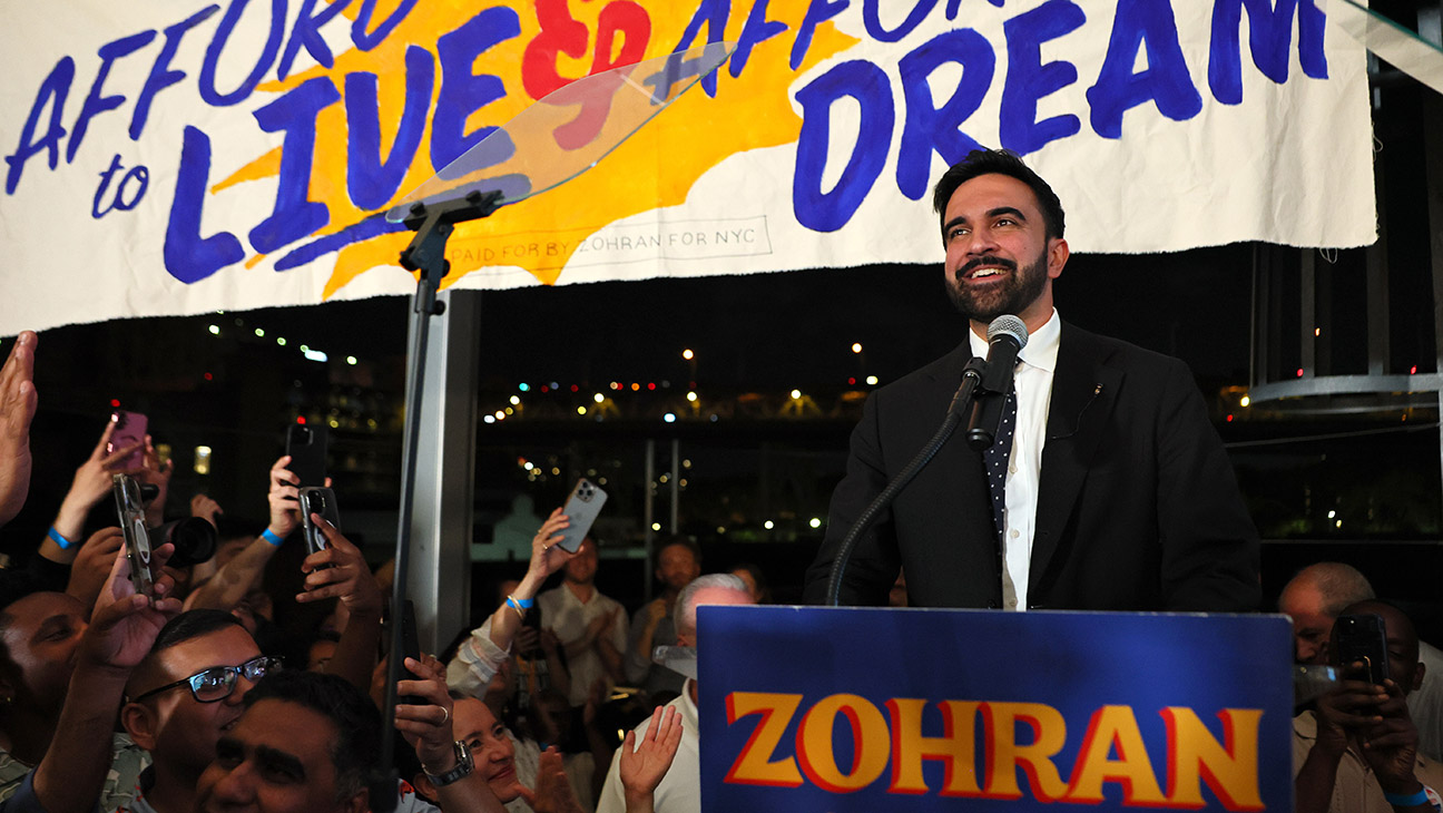
Royal blue, cranberry red and mustard yellow: New York City was awash in the stuff in the run-up to the Tuesday Democratic mayoral primary. They were the colors of Zohran Mamdani‘s out-of-the-box visual campaign, the centerpiece of which is a bold treatment of the 33-year-old candidate’s first name, incorporating an unconventional serifed font and drop shadow effect.
If you guessed the inspiration for that logo (or “mark” as it’s called in the biz) came from vintage Bollywood film posters, you would be correct. It’s a nod to Mamdani’s South Asian heritage. (His mother is Mira Nair, director of such classics of Indian cinema as Salaam Bombay! and Monsoon Wedding.)
But as Aneesh Bhoopathy, the man behind the visuals, explains to The Hollywood Reporter, the references go beyond that. The Philadelphia-based graphic designer says everything from bodega awnings to cabs to lottery tickets contributed to the look of a campaign that helped usher in a stunning upset — and a new chapter for New York politics.
Hi, Aneesh. Congrats on the big win and your great work on the campaign, which I’m seeing all the way from L.A. How did you get involved with the Zohran Mamdani campaign, Aneesh?
I’m a longtime member of Queens Democratic Socialists of America. I worked with them for a number of campaigns on the design side, some electoral, some for other kind of issue-based campaigns.
Zorah’s assembly race was in 2020. I had known him a little bit through the branch’s work, but not super well. He reached out, and we vibed. I think just being South Indian guys with similar politics and the same age and stuff. It was during the pandemic and I think because of that a lot of the typical operations of the campaign in terms of door-knocking and showing up at events was different. It was cool in some ways, because you kind of saw the opportunity to send out mailers and put a lot of design thought into them. He was super detail-oriented and I thought forward-thinking about all that. At the end of 2024 he mentioned he’s going to run for mayor and wanted to work together again. And that’s how I got involved in the mayoral race.
What was your reaction to him saying he wants to run for mayor? Were you like, “That’s a long shot,” or did you think, “Oh wow — I can see this happening?”
I knew he was very talented, and I knew he was really creative about how to reach people. I knew he was great at connecting with people. On the design side, I really admired how seriously he took design communications. I remember he wanted to do something about getting people to take the census and explaining the importance of it. He wanted to make something that looked like New York State Lottery scratch-off tickets. So it was so cool to have someone come up with ideas like that and then just be excited about what we could do with it visually. I definitely was like, “This is a talented guy.”
I did have high hopes for him because I had been around for his original election, which was a huge long shot. I been in DSA knocking doors for AOC and was there that night she beat Joe Crowley. I had been there for a bunch of other candidates that people considered long shots. I had seen the power of the volunteer machine and I knew the enthusiasm for that machine would be high. And so I was like, “If nothing else, it’s going to be a way to build that machine and be in more neighborhoods and get more people comfortable with talking to their neighbors. I was like, “Hell yeah, let’s do it.”

Let’s get into the design. I guess the main image that caught my eye was this drop shadow treatment of his first name. Three colors that repeat throughout the campaign. There’s a sort of mustard or tangerine color. And then blue and red. So, can you tell me how you chose those colors and how you came up with that very striking drop shadow letter treatment?
It’s began as being inspired very much by what I would call bodega signage — that bright yellow awning that’s meant to stand out. It’s a taxi cab kind of yellow that’s just built to stand out. The thinking was, if it works for them, why not? And Zohran has done some work with taxi cab drivers, so there was a bit of a resonance there. It’s the primary colors that are on so many things in New York, like the Metro Card and the New York Lottery.
Does this yellow have a name? Because it’s almost half orange, half yellow. I wouldn’t quite call it yellow.
It’s a little bit toward orange, for sure. I think I’d have to look through a Pantone book at its name. I think mustard’s a good name for it, even though there is something about the word mustard I don’t love.
I saw some discussion online about it being Bollywood inspired. Is that true? If so, how does that fit into the equation?
Originally, the mark [or main logo] was going to be in sans-serif font that you see at the bottom, the part that says, “for New York City.” That font is called Portland North and was going to be the actual “ZOHAN” piece, as well.

It was maybe a little bit less expressive, but I didn’t mind it. But Zohran was interested in pushing how expressive it could be and trying some other fonts. So, I mentioned Bollywood posters as an inspiration. He sent a couple over. There’s definitely expressive typography in them and you see a lot of yellow and red.
We weren’t going to shy away from looking different from the standard campaign font. And playing into the identity of being South Asian. So we tried some different types of styles. We started with a font called Boheld. It had this beautiful Z. Just off that Z alone, we tuned up the typeface until it was right for him and added the shadow.
I’m looking at Boheld now. I see it used on whiskey labels. It looks like Old English, almost.
It’s funny. Yeah, I think people would probably be surprised to learn that with the starting point.
So have you coined a new font? Is this Zohran font?
I don’t actually know in the typography world how far away you have to get from the source of material for it to be kind of permissible in that world. It could be cool, though.
Thank you for walking me through that. Were you at the victory party?
Yeah, I was there. I got to talk to him briefly, give him a hug.
And what’s the plan going forward? What do you call this anyway? What’s the term for the overall visual look of his campaign?
I guess they call it branding. I feel that’s a little incorporated, and I prefer to call it “identity work.” Besides this, we also worked on campaign literature. My partner Phil at my co-op did all their web work. Then we did their literature. And all the merch that you see on Instagram, the bandanas and the fans. Just ways of creatively extending that brand into stuff that got people excited.
So you’re going to stick to these colors and these visuals through the actual mayoral election?
Yeah, haven’t completely discussed that yet. I imagine that would be the case, though.


Leave a Reply