
After staring at, scrolling through, and puzzling over Apple’s new Liquid Glass design language on my iPhone for the better part of an afternoon, I don’t hate it. But I also think it needs a little more time in the kiln.
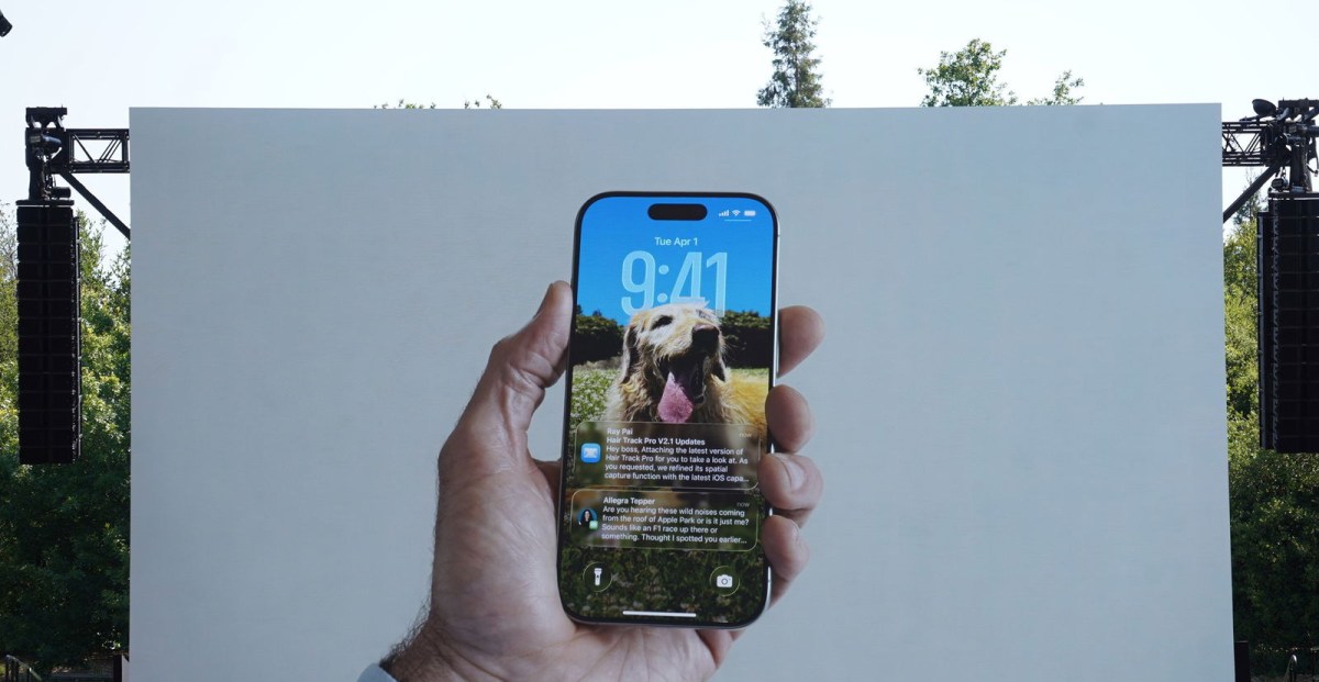
Apple announced Liquid Glass on Monday for all of its devices at WWDC 2025. Perhaps the most noticeable thing about it is that app icons, tab bars, and even the text magnifier you’ll see when you hover over words feel, well, liquid-y and glassy.
The idea seems to be that because they’re “floating” a layer over things like your lockscreen wallpaper or text, the “glass” can be translucent to give you a sense of what’s under them. It makes sense. The initial implementation in the iOS 26 developer beta has many of Apple’s signature flourishes and attention to detail.
But boy are the changes jarring when you first see them.
Let me show you just how dramatically it changes things. Below, on the left is a picture of my iOS 18 lockscreen I shared with David Pierce for the Installer newsletter just last month, and on the right is my lockscreen today, on my iPhone 16 Pro with the iOS 26 developer beta (out now) installed.


Even in my intentionally grayscale homescreen, I hope you can see that the differences are immediately apparent. Everything is transparent and shiny.
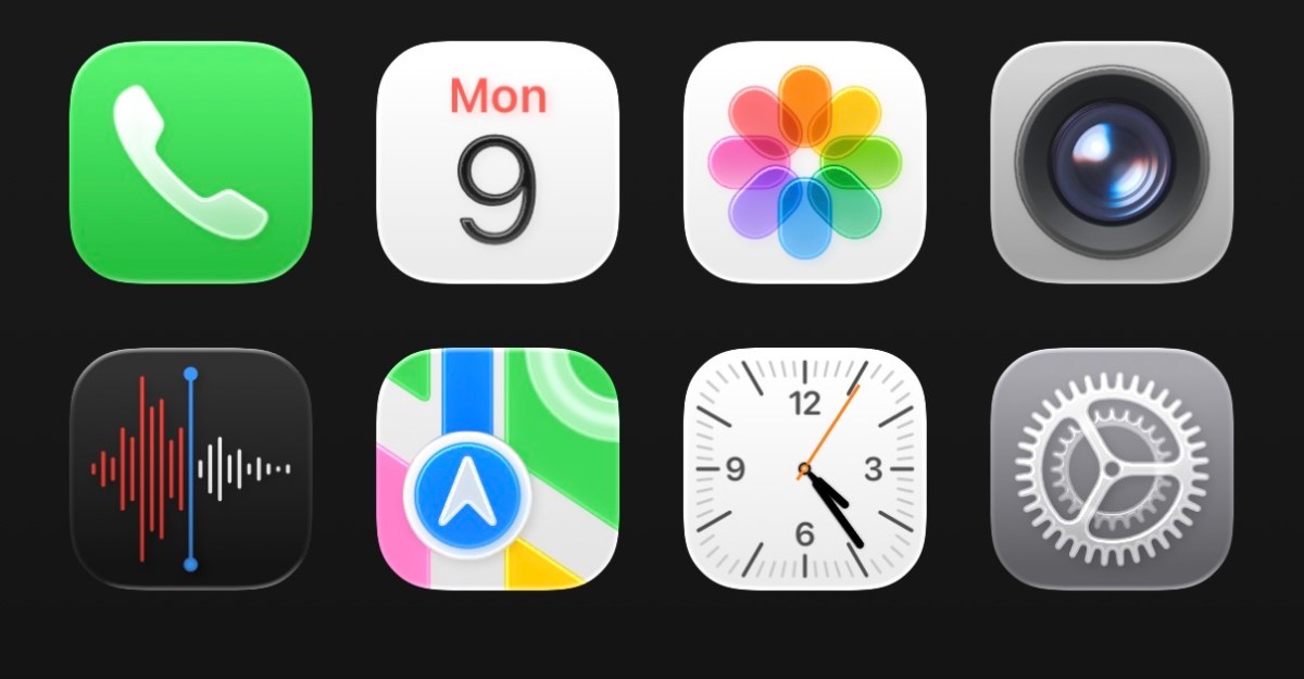
Here’s my homescreen with the color added back in, if you want a different way to look at it. Many icons are familiar, but they’re all… bubblier.

Screenshot by Jay Peters / The Verge
Here’s the Control Center, which is frankly a mess right now. The transparency of Liquid Glass makes it look cluttered, and that’s even with my gray homescreen. I hope Apple makes everything under the Control Center a little more opaque so that it’s easier to read at a glance.

Screenshot by Jay Peters / The Verge
The Clock app shows a good example of the finer details that have changed. The bottom tab bar is rounded, and when you tap different tabs, the selector shifts over in an animation that I can best describe as a water droplet moving across the tab. (Pressing and holding the droplet allows you to drag it across the tab bar, which is an admittedly cool effect.) You might also notice that the button to turn the alarm on and off is more oval than circular.

Screenshot by Jay Peters / The Verge
And here are a few other tidbits that I thought would be worth sharing. The iOS keyboard has an all-new look:

Screenshot by Jay Peters / The Verge
The Settings app has way too much space between each setting category (which is a problem I’ve also noticed in the messages list in Messages):

Screenshot by Jay Peters / The Verge
Things under the URL bar in Safari will “bend” due to the Liquid Glass design:

Screenshot by Jay Peters / The Verge
And system prompts look different:

Screenshot by Jay Peters / The Verge
At first, I hated the big changes. That surprised me. I’m usually fine with UI tweaks. Back in the day, I was on board with even the earliest and worst versions of iOS 7. But after a couple of hours with the iOS 26 developer beta, Liquid Glass is growing on me.
My iPhone still functions like it used to. I have a lot of small complaints, especially with the spacing of settings functions and Control Center. But I expect Apple will tweak and fix a lot of the bigger issues ahead of the official launch of iOS 26 this fall.


Leave a Reply