
Design, to quote a wildly overused Steve Jobs-ism, is how it works. And if that’s the case, Apple’s new design language, which the company is calling “Liquid Glass” and just announced at WWDC 2025, is really nothing new at all.
The Liquid Glass look comes largely from VisionOS, which shipped with a particular constraint: it had to layer digital information over your physical world, without occluding that physical world. That’s why everything in VisionOS is translucent and glassy, so you can both see it and see through it. Everything is layered and three-dimensional, an effort to make digital experiences feel more like objects in space than objects on a screen.
The impetus for turning the VisionOS look into the Liquid Glass system, Apple software boss Craig Federighi said at the beginning of this year’s developer conference keynote, was that Apple’s devices are more closely connected than ever. That’s certainly true: Apple’s ecosystem remains tight, and there are lots of good reasons to buy an iPad if you have an iPhone or an Apple TV if you have a Mac. (Call it synergy, call it illegal monopoly maintenance, you pick.) Most of Apple’s devices have a lot of features in common, and it makes sense to bring them all more closely together. Putting elements in familiar places, making sure things work the same everywhere — these are all good things!
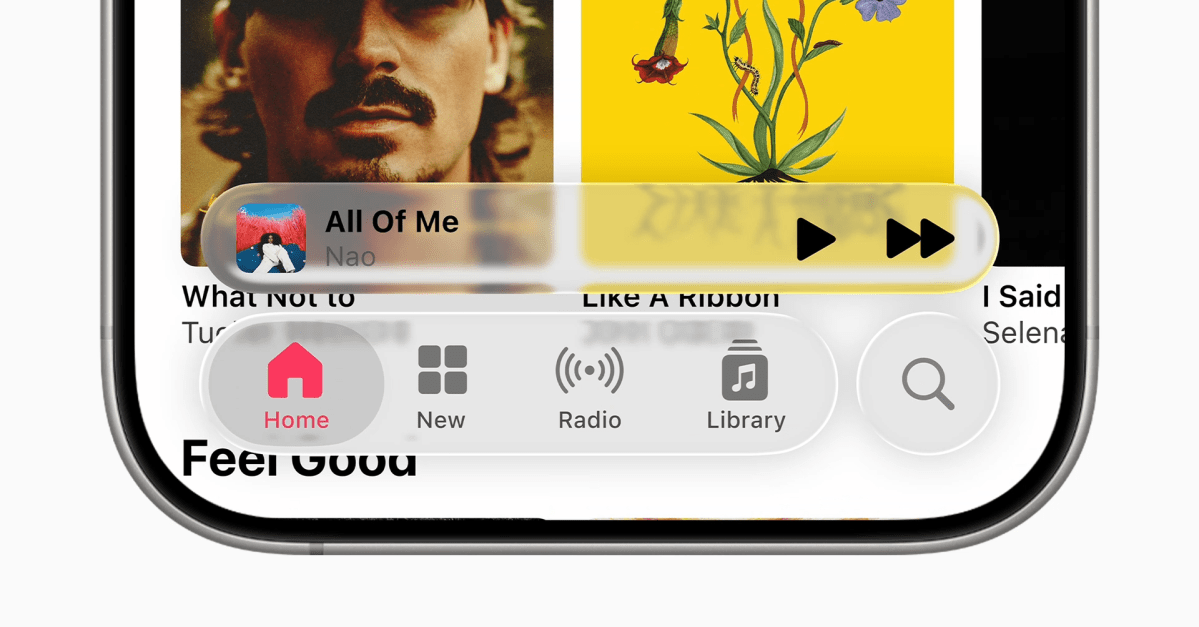
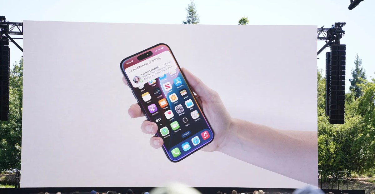
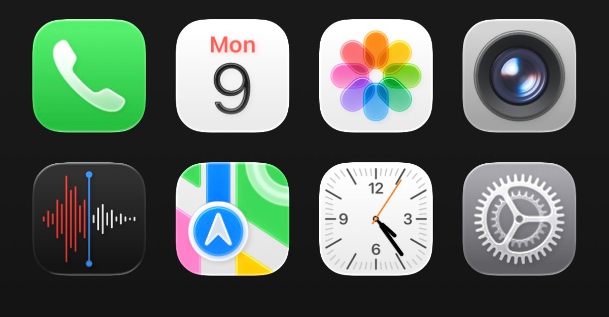
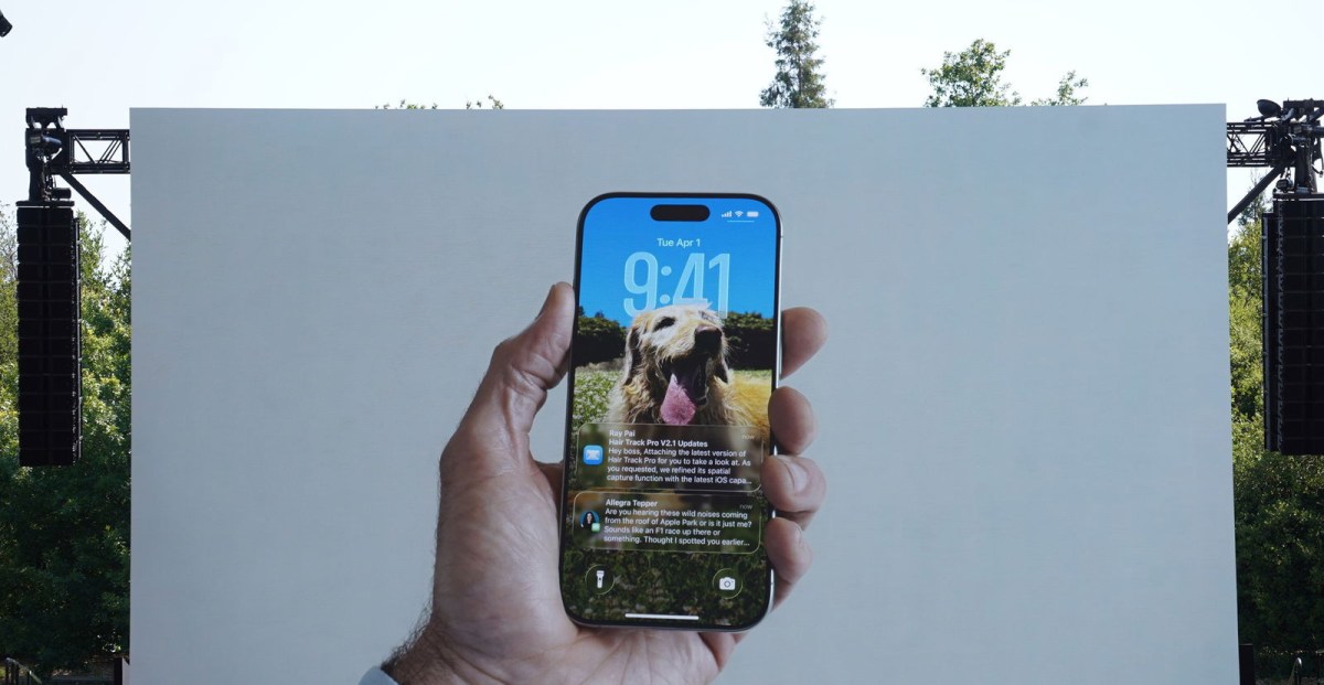
Leaving aside the somewhat wild decision to pivot your entire UI system around a prohibitively expensive headset hardly anyone has ever even tried, the thing about most of Apple’s devices is that they aren’t overlaying digital information on the physical world. They’re just screens! So the little glass loupe that slides over text as you highlight on a webpage won’t feel like you’re moving something around; it’ll feel like you’re poking at a fake water droplet on the screen. The playback controls that seem to float slightly above your content, refracting its light and colors, look to my eyes a little like a hokey 3D effect. The navigation buttons that ripple as you scroll a webpage don’t look like physical objects — they just look busy and hard to read. Apple executives frequently made a point of noting that Liquid Glass is minimalist and “keeps your content in focus,” but the constantly morphing interface feels to me like it might be even more noticeable.
There is one thing about Liquid Glass I really like. Now, when you tap on an alert or a menu item, the rest of the content appears from within, as if it were contained by the thing you just tapped. That’s a clever way to keep people anchored in place. You won’t tap something, only to be taken to another screen, with no obvious way back to where you were. The menu just radiates out over top of whatever you were doing, and then folds back in on itself when you’re done. It’s far too easy to get lost in your phone, and this is a nice touch.
You really can’t look at Liquid Glass without thinking of Windows Aero, the similarly glassy and translucent design language that shipped with… Windows Vista. (Tough comparison, that.) With Aero, Microsoft made an effort to make it easy to know where you were on your computer, and to find everything you needed. You could see through windows to other windows; app borders would change to match the content within; you could use widgets and live thumbnails to get quick access to information. Aero didn’t last, in part because it was a huge resource suck to render something so graphically intense. Now, Microsoft’s design is much more colorful, and even more aggressively physical — there are drop shadows everywhere.

The ideas behind both Liquid Glass and Windows Aero are good ones! They stand for personalization, customization, for helping people figure out where they are and what they’re doing on their device. Apple has long been unmatched in executing this kind of stuff, too, and the demos we saw at WWDC today suggest that this layered, three-dimensional effect will work smoothly across all of Apple’s devices. But for all the epic language of the unveiling, I don’t see much in Liquid Glass that will matter. Maybe we’ll get more in the months to come, and maybe developers will figure out how to make the best of the layers. But for every place this kind of layered translucency makes sense, there will be lots of places it just looks like a mess. It won’t change much about how you use your devices or the way you perceive them, and at least to my eyes, it doesn’t even make them better-looking. It’s just … slightly different.
Watching Apple’s announcement, it’s hard not to read the whole thing as borne of efficiency rather than of inspiration. Alan Dye, Apple’s vice president of design, started his portion of the keynote by harkening back to iOS 7, and its simple, layer-based look. “Now, with the powerful advances in our hardware, silicon, and graphics technologies,” he said, “we have the opportunity to lay the foundation for the next chapter of our software.” He called Liquid Glass “our broadest design update ever.” Not biggest. Not best. Just broadest.
In that broadest sense, it’s logical that this is where Apple landed. It obviously wouldn’t, and probably couldn’t, fundamentally change the look and feel of every device it makes for billions of users around the world. No one wants that. So Apple just took all its elements and made them more universal: everything’s a little more round, a little more contained, a little less designed for a specific screen size. A floating menu of black and white icons works pretty much anywhere, you know? By turning menus into lists that pop out of buttons, Apple prevents itself from having to optimize every menu for every device and screen orientation. Liquid Glass is the lowest common denominator, done about as well as you could.
But I’m not impressed, and I’m not optimistic. Apple is at its best when it has strong opinions about how things should work; even the attempt to get out of the way and let your content dictate everything feels like the wrong tack. Plus, I’ve spent the past year tinkering with Apple’s new tinted and color-matching iPhone homescreens, which mostly serve to make your device uglier. I don’t see a reason that Liquid Glass would make my devices better, simpler, or more personal. I just see buttons that are harder to read.


Leave a Reply